Hands-on design of brand refresh, visual system, and website experience.
The Paramount Theatre is more than a venue. It is a preserved piece of community memory — a landmark nearly lost to demolition in the 1990s and restored through the conviction of local leaders. For generations, it has served as the backdrop for concerts, school performances, touring productions, weddings, and shared civic moments.
The brand and website needed to reflect that same sense of permanence, craft, and care.
Over time, the identity began to drift. Logo iterations moved away from their historic foundation and lost the craftsmanship the theatre represents. Gold shifted toward brown. Color usage became inconsistent. The name expanded to “Paramount Theatre Centre & Ballroom,” unintentionally diluting its primary identity.
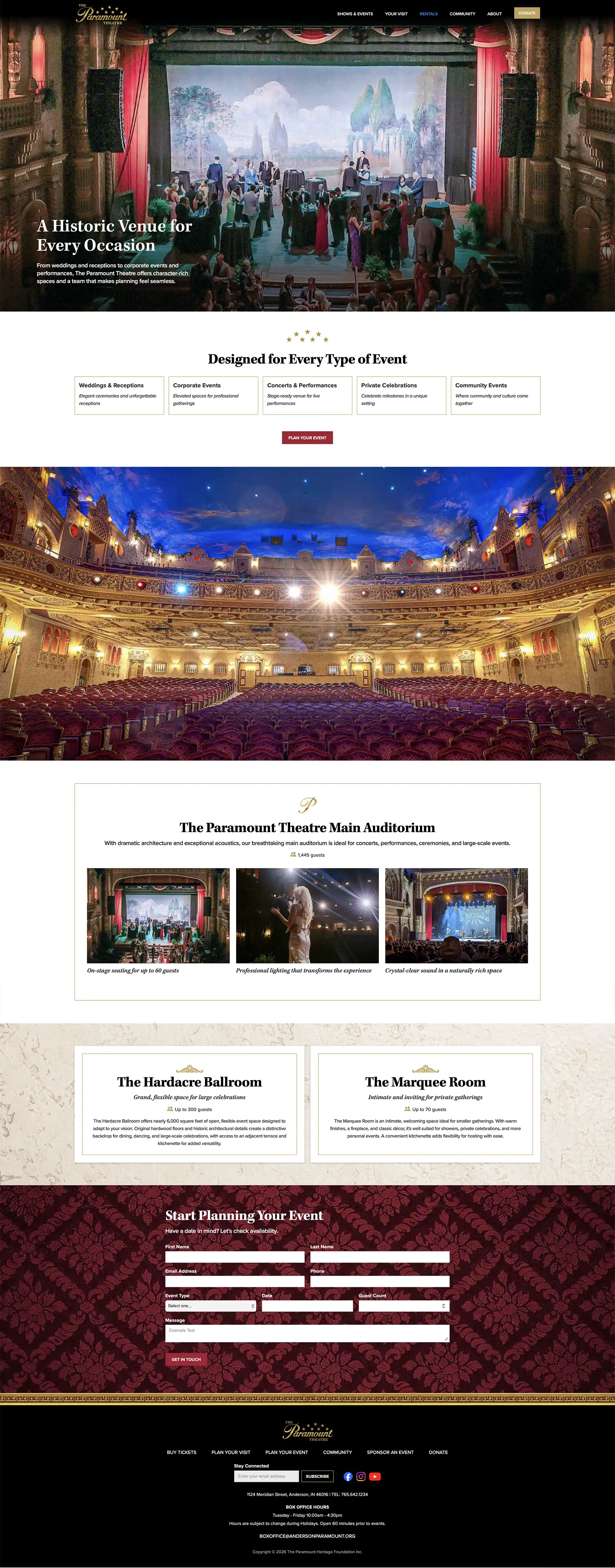
The website had also become dated and fragmented. Navigation was unclear, and the experience did not reflect the beauty, atmosphere, or stature of the theatre itself.
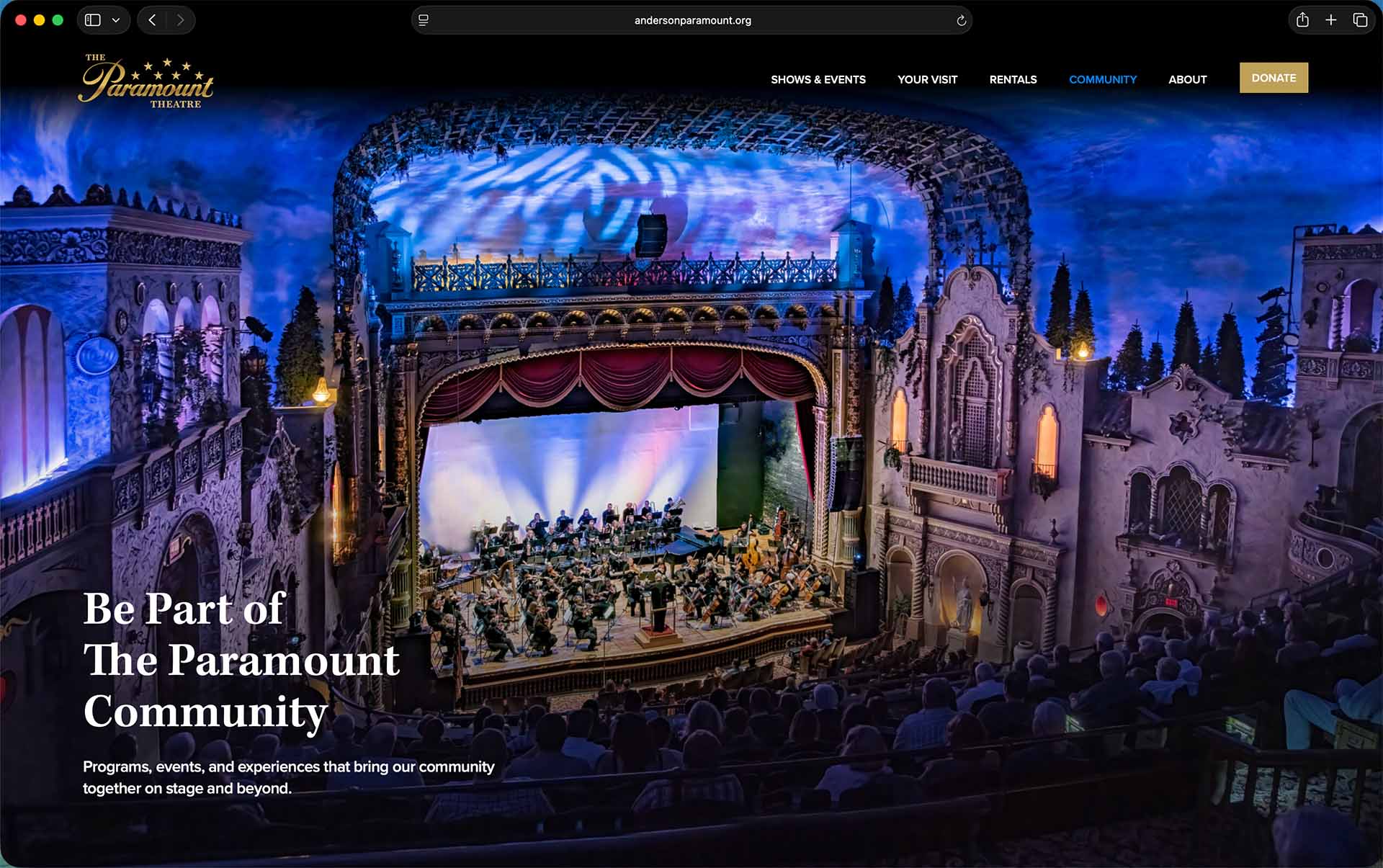
The Paramount Theatre is first and foremost a theatre.
The solution centered on simplification, discipline, and a stronger connection to place. The name was clarified. The visual system was refined. Richness was restored.
The website translated that system into a clearer digital experience — helping visitors find shows, plan visits, explore rentals, support the theatre, and understand its role in the community.
The result is an identity and website that honor the theatre’s legacy while providing a steady, unmistakable framework for future programming, promotion, and growth.
Each performance can shine while the theatre itself remains constant.
Drawing from the theatre’s 1930s heritage, the signature was custom drawn to restore craftsmanship to the mark. The letterforms reference the original Paramount Studios script of the era without recreating it. The result feels shaped rather than manufactured — a wordmark with weight and intention.
A custom “P” anchors the identity, balancing elegance with legibility. A complementary classic serif is tucked deliberately beneath the script, reinforcing structure and hierarchy rather than hanging as an afterthought. The arrangement of stars was reoriented to arc upward — echoing the theatre’s iconic starlit ceiling while introducing subtle movement and lift.
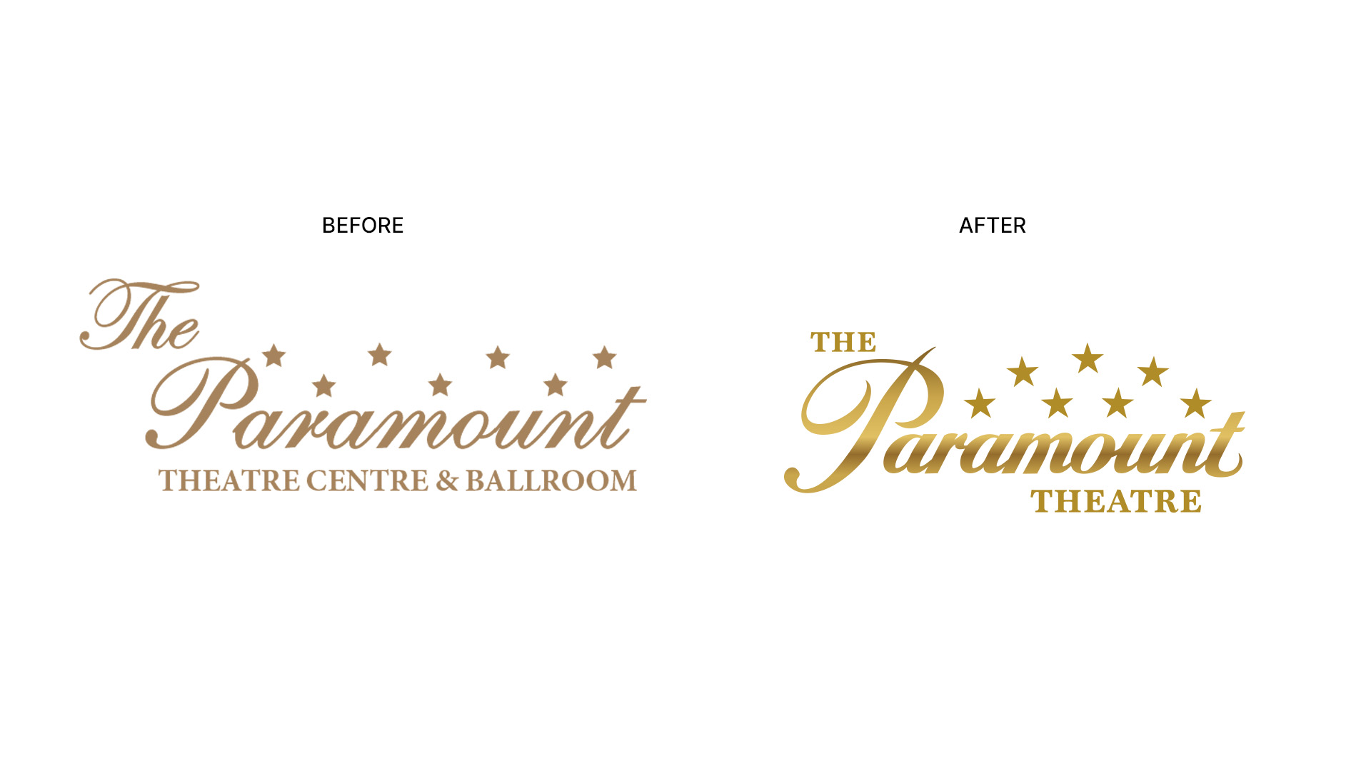
Inspired by the building’s gilded detailing, the mark uses a refined gradient to restore richness and dimension — avoiding the flat brown tones that had diminished the previous identity. The finish reinforces the premium experience guests associate with the space itself.
from the upward movement of the stars to the distinctive loop of the “t.” The signature honors the theatre’s legacy while reclaiming the sense of permanence and care it represents.
The identity refresh also simplified the organization’s public name. “Paramount Theatre Centre & Ballroom” was streamlined to The Paramount Theatre, reinforcing focus and memorability.
A formal usage standard was established: the name is always written as The Paramount Theatre, capitalizing “The” as part of the official mark. The adjustment strengthens consistency across communications while preserving equity.
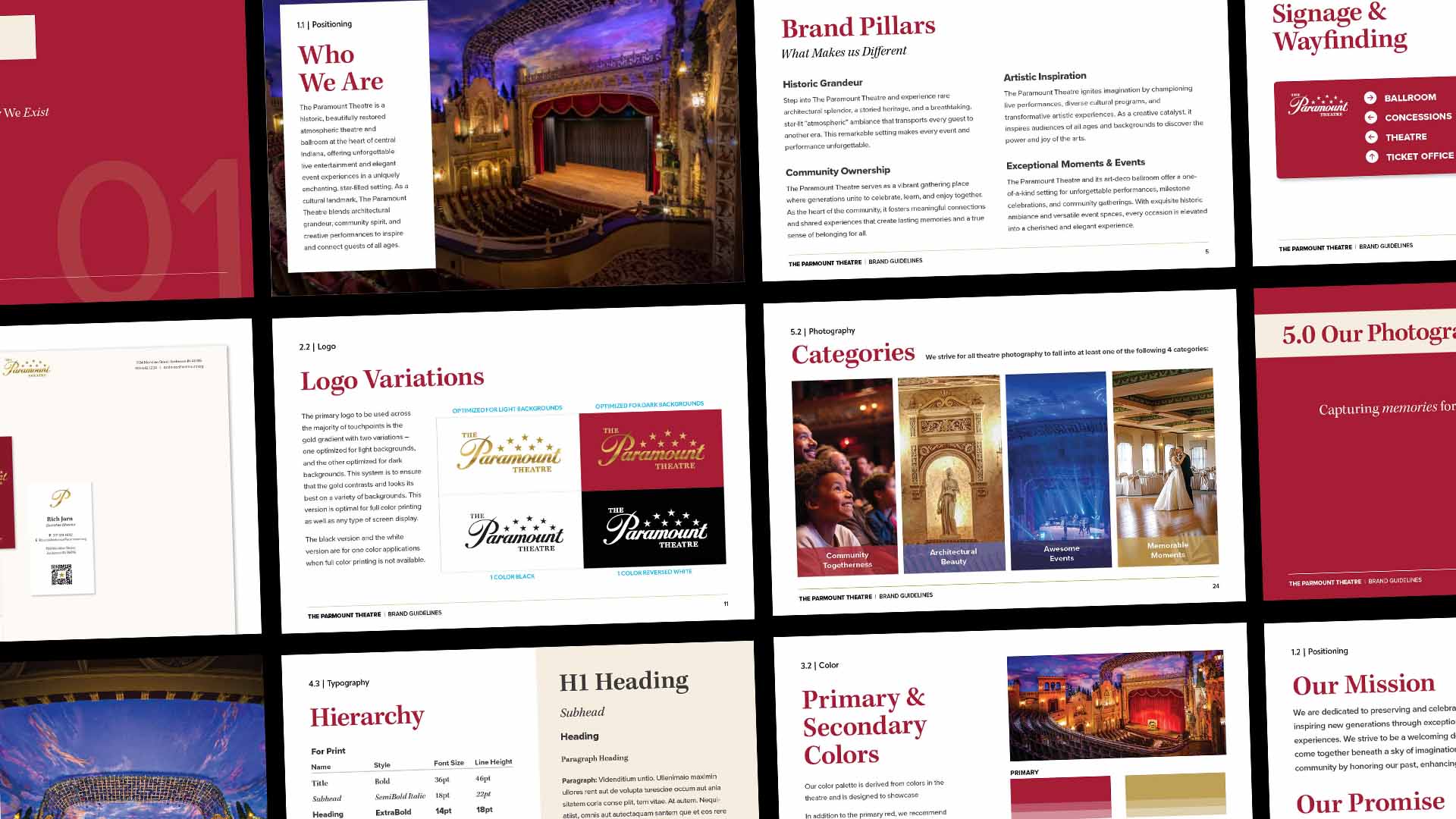
To ensure longevity and consistency, the identity was formalized into a comprehensive brand guidelines document. The guide outlines logo usage, color standards, typographic hierarchy, photography direction, and environmental applications — providing the internal team with a clear framework for stewardship.
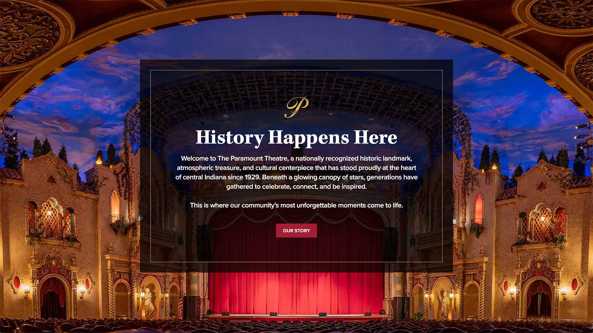
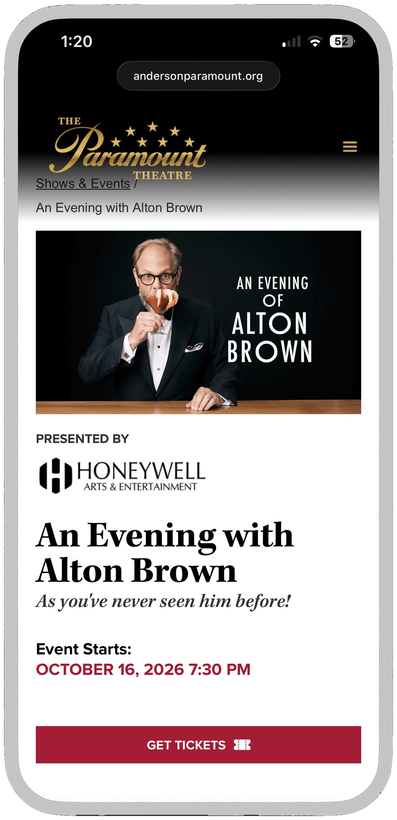
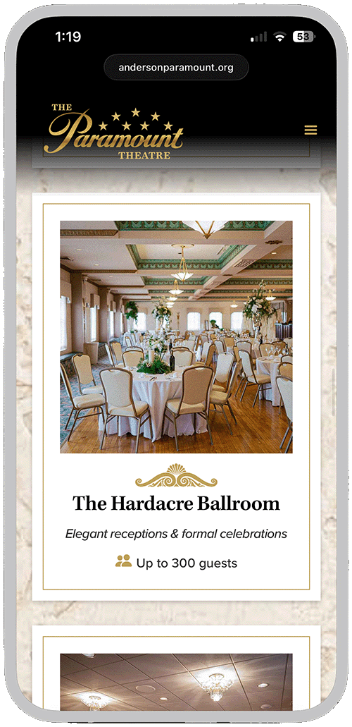
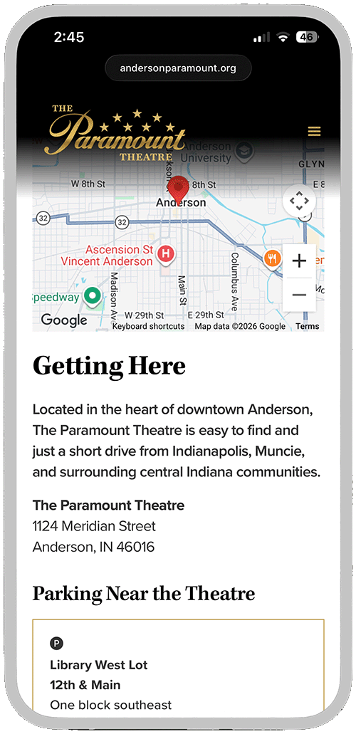
The website became the brand’s primary public touchpoint, bringing the refreshed identity into a more complex digital experience. The design needed to honor the theatre’s craftsmanship and historic detail while helping visitors quickly find the right path — shows, rentals, community events, donations, tours, sponsorships, or visit planning.
The structure is built around audience intent, with “find a show” as the primary path. A flexible CMS supports show and event listings, sponsor logos, ticket CTAs, metadata, and evergreen visit information. The same content system also powers sponsorship pages, adapting the experience around sponsor messaging and calls to action instead of ticket purchase.
To keep the site rooted in place, visual details were drawn from the theatre itself, including architectural forms, velvet seat backs, stucco texture, and custom photography.
To guide expression across messaging and visuals, the identity was grounded in four core pillars: Historic Grandeur, Community Ownership, Artistic Inspiration, and Exceptional Moments. Each represents a distinct dimension of the theatre’s role — history, belonging, performance, and memories.


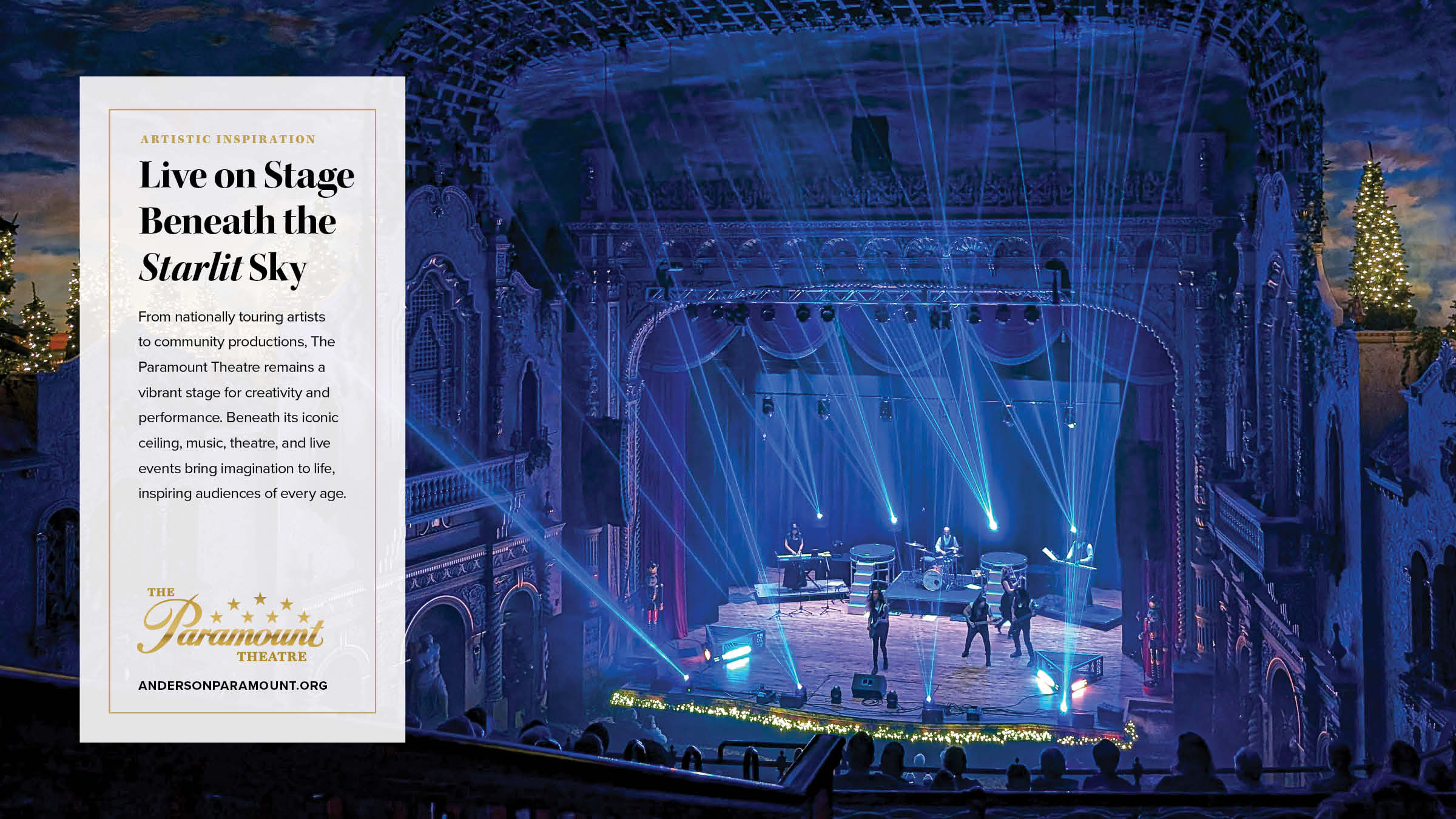
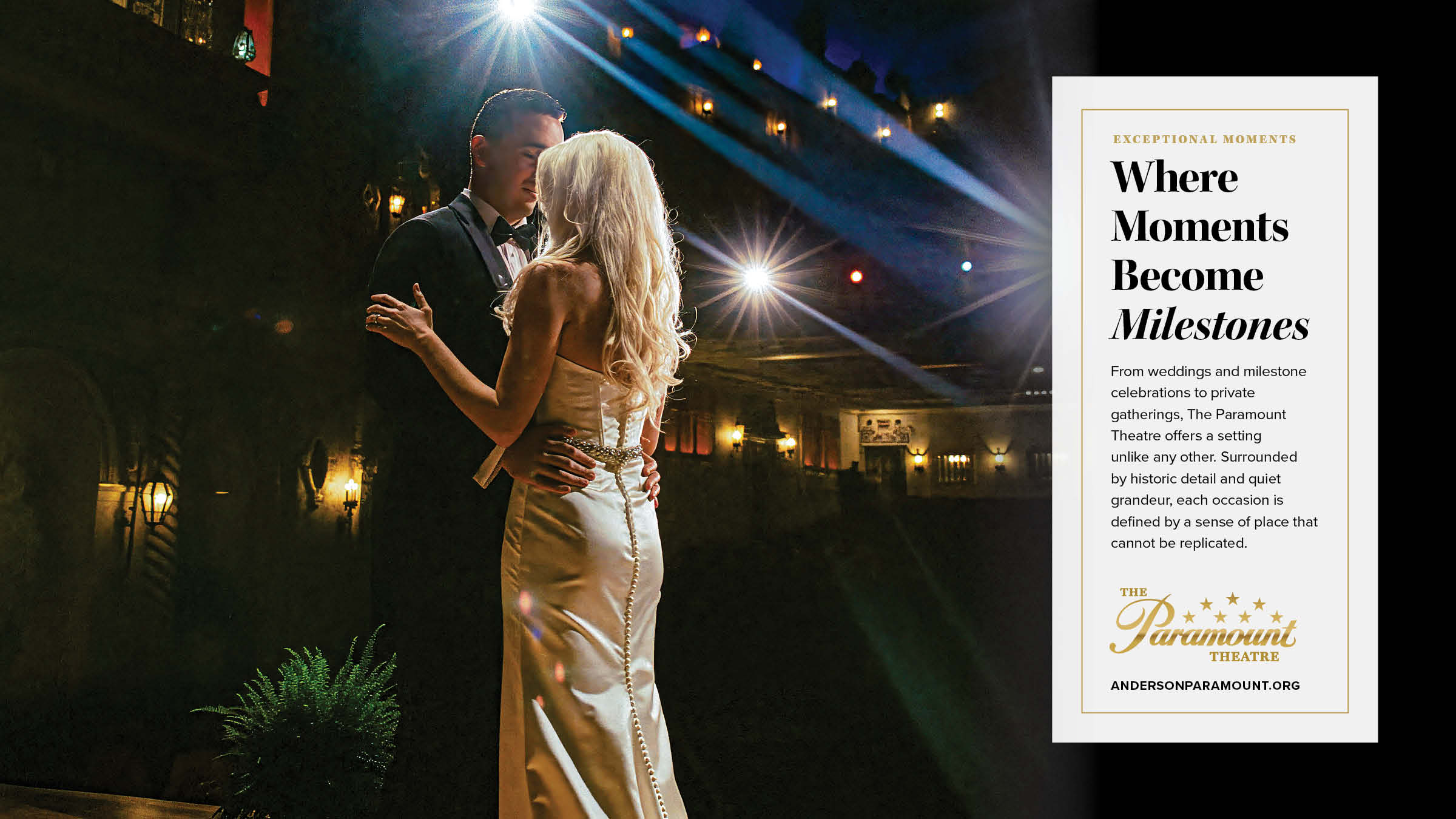
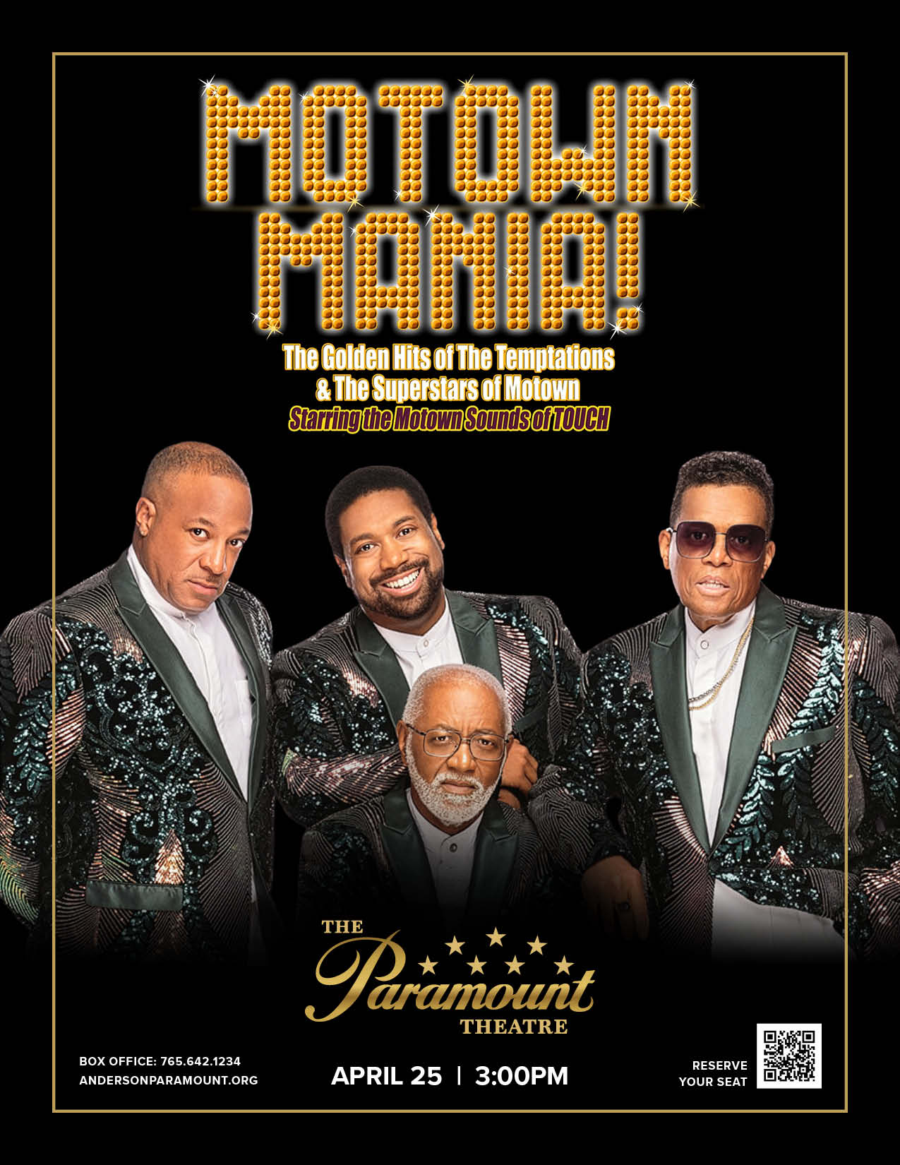
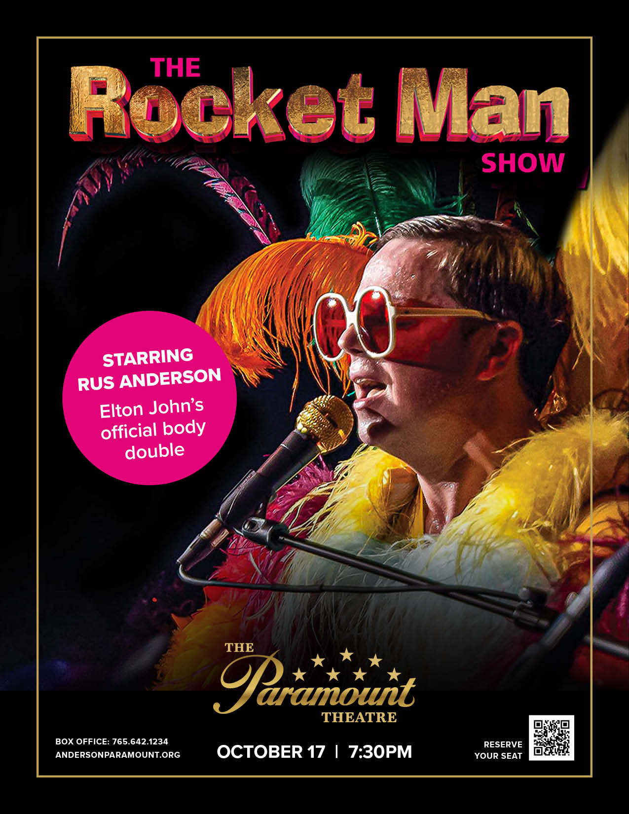
A disciplined identity must perform in real-world promotion. The system was designed to flex across posters, digital platforms, and co-branded tour artwork without losing clarity or authority. Show branding leads where appropriate; the Paramount signature anchors every piece through consistent placement, scale, and hierarchy. Whether promoting nationally recognized performers, free community programming, or in-house events, the venue remains visually cohesive and unmistakable.
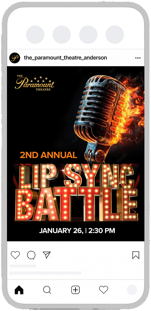
The identity scales seamlessly into mobile-first formats. Social media applications maintain the same structural discipline — clear hierarchy, restrained use of gold, and consistent signature placement. Every post feels connected to the broader brand system, so the theatre’s presence remains steady, regardless of genre or format.


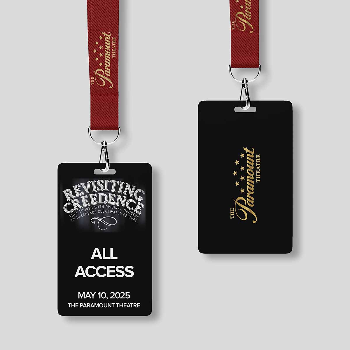
The identity carries beyond the stage into merchandise and operational touchpoints. From apparel to credentials, each application reinforces recognition through disciplined hierarchy and material richness.